
Argos Checkout Re-design
The Argos checkout was long overdue an update. We were required to re-platform onto a new tech stack, and therefore, the team were given the opportunity to pinpoint customer pain points, and not only improve the overall user experience and journeys, but also make the checkout experience completely responsive, and update legacy designs to align with the BOLT 2.0 Design System.
Role
Year
UX/UI Lead
2018-2019
Team
Simon Poole | Nick Lister | Emma Hodges | Moh Khan

USER JOURNEYS
The below shows the journeys that a user could potentially go though depending if they wanted Collection or Delivery versus Pay Now or Later. I worked with Simon, a Senior UXA, to aid in the re-platforming of the collection journey, pre-pay journey (highlighted) and improving the overall experience & working with the business to increase conversion.


KNOWN ISSUES


RESEARCH & COMPETITOR REVIEW
Below outlines the research that was undertaken throughout this project. Working closely with the Lead UX Researcher, we were able to put together a timeline of research where guerilla and remote testing bridged the gap between in person laboratory testing, making sure we were constantly & iteratively designing based on user feedback.
Another important point that aided the quick iterative nature of this project, was that all designs were made and refined in interactive, responsive prototypes. The mantra here is that everything is built as a prototype, never flat.
Myself and Simon undertook quite an extensive competitor review to not only look at checkouts from Argos competitors and sites that their users would generally use, but also specifically hunted down sites that had an iframe within their experience.


LOW-FIDELITY DESIGNS
I began this project by creating very low fidelity designs, as well as a number of different versions to begin with. I began narrowing this down by getting colleagues on my floor to give feedback from posters of the designs and interactive prototypes. This feedback allowed me to narrow down the options and in workshops get PM, stakeholders and other designers to then further critique and explore options from the prototypes.

GUERILLA TESTING
Argos has the advantage of having many physical stores close to the office, so I was to be able to go and test very quick concepts with real users. This coupled with our custom UX Research Lab allowed me to test an idea and rapidly iterate on it, fail fast and then re-test. All designs were built from the very beginning as prototypes to allow quick turn around to facilitate this.
A great example of this was various iterations of designing an order summary section on the checkout. We worked on iteration after iteration, trying out different patterns to make an expandable section clear to the user. After many attempts it failed, but that’s ok. As with this rapid guerilla testing format, I was able to discount this with the extent of the work undertaken.
All research was undertaken by myself, Simon and Moh from crafting the tasks based on hypothesis to outlining the results.

REMOTE TESTING
As the base of the page began to be cemented, my Lead UX Researcher and I focused on some of the more complex journeys. Doing unmoderated, remote testing via UserZoom in itself was a good test of the design, as simple tasks like add a promo and buy your items, were in a good enough state to test. During this process I began testing desktop designs, also looking a large single column vs right hand rail.
The Lead UX Researcher and I crafted these tasks together based on my hypothesis and set the tasks live. After the sessions, conclusions were drawn up by myself and the UXA and UXR, and further design iteration was based on that.
LAB TESTING
Lab testing was undertaken throughout the design process and gave us fantastic insights. Even at the earliest stage, designs were shown and tasks were given on them to see how Argos users faired. This was vital as it helped me understand very early on how the page should be structured and crucially why. Users always need to have a guiding light of that primary CTA, we found this out very quickly, so I made sure every step a users had to do, simply had that helpful guide.
The Lead UX Researcher and I crafted these tasks together based on my hypothesis and they moderated the testing while I notetook. After the sessions, conclusions were drawn up by said UXR, and design iteration was based on that.

IMPIRICAL EVIDENCE & ANALYTICS
It’s vitally important to also follow conventions and tested patterns by usability experts (not just someone on Medium...) as well as taking into account quantitative data on how your users actually use the site.
As such, each and everything on each page, is there based on analytical data, internal or external usability research or technical restriction. Nothing is left unconsidered.


PAY NOW
PAY LATER
The decision was made to design, build, launch and test this particular page in isolation from the other pages in the Pre-Pay Collection Journey re-platform.
Each version was launched as an A/B test against the legacy design and left to run to reach statistical significance.
LIVE DESIGNS
This option utlised a different design pattern of stacked blue, large buttons not giving the colour hierachy and also allowed the user to scan both options quickly and easily. The price total was also included in the header so the users is never in doubt that the price isn’t changing.
Across the board, this was significantly up not only on all previous versions but also on legacy too:
+0.8%
This equated to an incremental revenue increase of +£17million.


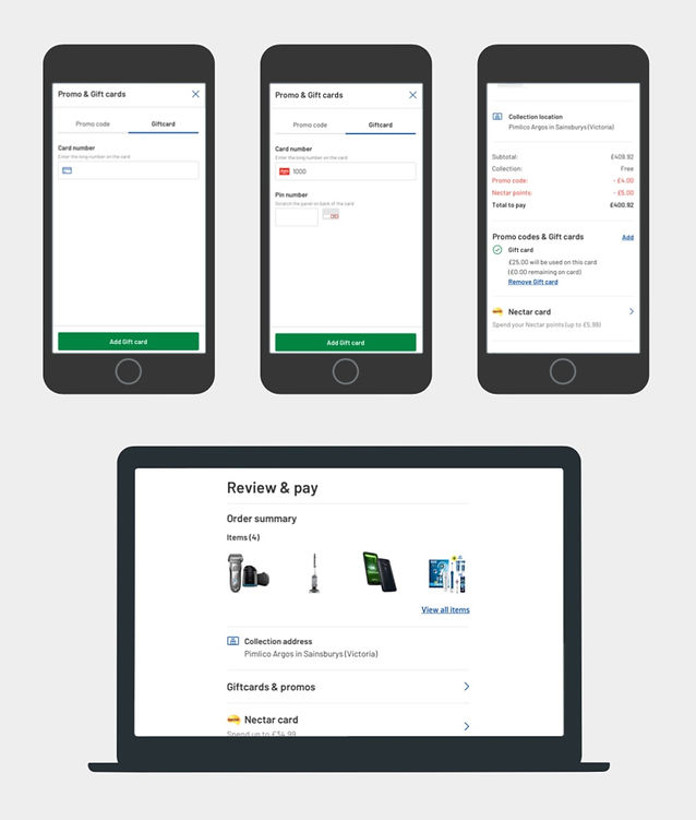
CONFIRM & PAY PAGE
As the title suggests, the page is to simply review that all the necessary things (items, collection location, etc) are correct and to pay (potentially promos & nectar). The design is based around this simplicity and streamlining complex mechanisms (address & payment form fields).
DESKTOP
At 992px upwards, the top order summary kicks out and becomes a right hand rail. This gives the left hand side the attention to the user of what must be done, while the right hand rail is supportive information.
ADD/EDIT JOURNEYS
All actionable features are on modals only being brought in when required by user, helping to keep the core page clean and easily able to digest.


ORDER CONFIRMATION PAGE
Again a similar layout where below 992px, we have a single column design, and above 992px we have a right hand rail.
One key area is the collection details section, Argos store workers stating that the biggest issue users have is not knowing when their items were ready. We paid extra attention to detail in regard to making sure this info was clear and scannable as possible, and that even at a 320px phone size, taking a screen grab would get all of this information in one go.
OUTCOME
This re-platform is looking to be delivered after peak in early Jan 2020, so full results will be seen then. This is to be launched as an MVT (versions shown above) and will be measured on primarily conversion, but sub metrics such as errors, time on page, etc, to quantitatively measure the best solution for the business.


